

There have been a lot of big changes to MTR lately. MTRoA is getting a huge number of features which were previously only available on Windows. You can read this post which I wrote on the next big update https://ucstatus.com/2023/02/27/microsoft-teams-rooms-on-android-update-1-2023/.
Microsoft Teams Rooms on Windows is always getting new features or changes to how things are represented. For instance, Cortana moved around a few times before finally settling on the lower left. Well the next update is the biggest yet.
MTRoW update 4.16
Microsoft announced 4.16 in the message centre just before ISE. At the same time they pushed a pre-release to the TAP program to get tested and validated. The Message Centre post has since been updated to say that it will start rolling out in March and fully rolled out the end of March.
Check out this video tour then read on
What’s changing?
The user interface is getting a complete overhaul. Below are the touch controllers from the old and new UI for comparison

You will note that the new UI resembles the Android experience. Although you will notice that the current Android MTR UI is different on the controller and the FoR screens.

However, Microsoft is standardising on the Android look and feel on all Teams room devices. With the calendar box on the right and controls on the left. I think over time the touch controllers on both Android and Windows will be almost the same if not exactly the same.
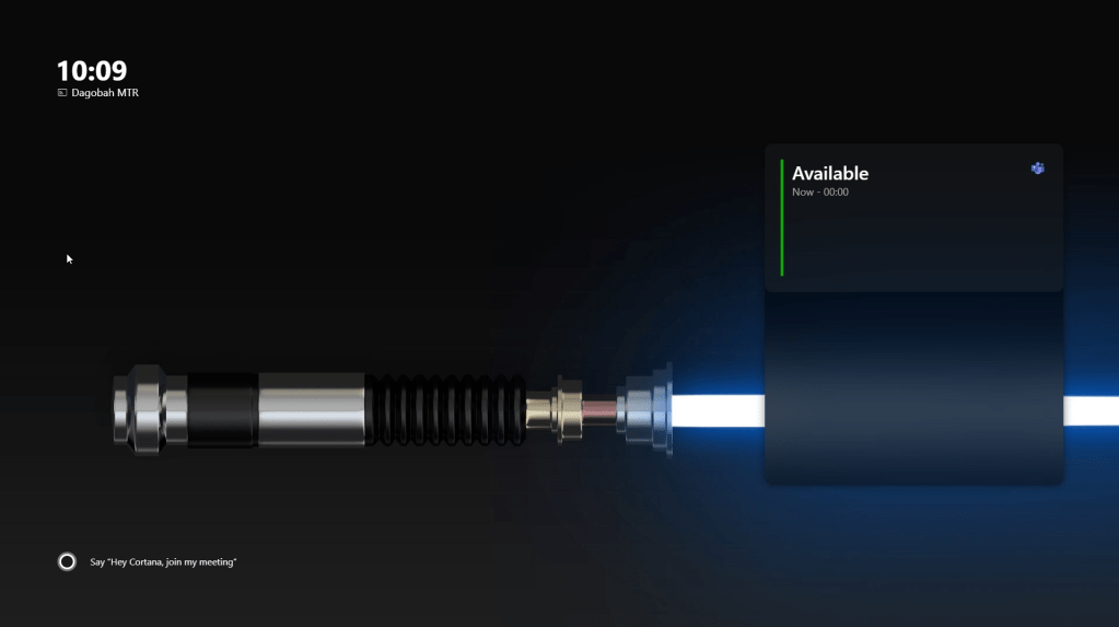
The other big thing is the Front of Room Display. By popular demand, Microsoft is putting the room calendar on the screen just like in Android Rooms.
What else has changed?
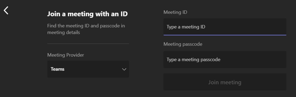
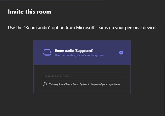
Quite a lot. You will note that some of the things that were previously hidden under “more” have been promoted to the main screen. Join with an ID and Invite the room are front and centre.
Invoking Join by ID opens the same screen as before
Invite the Room displays more of a training guide for the options available to a user.
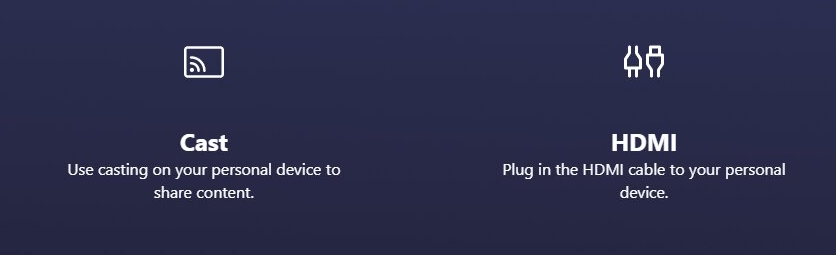
Share brings up two choices, although the choices aren’t buttons. More of a reminder of the options available to users. These are displayed on the touch console and FoR display if you don’t have anything plugged in.
If you do plug in HDMI it still auto shares into a room that’s idle (not in a meeting). And the share button changes to stop sharing.
This auto share at idle is a problem for some. Anyone with a permanent in-room PC or external sharing device such as a Barco or Mersive will know what I mean. When the room is idle you really want to show the standard Teams Room FoR display and not the connected PC or Barco home screen. Android Rooms just got some admin controls for auto sharing both at idle and in a meeting. So be patient and I think this will probably come to Windows too.
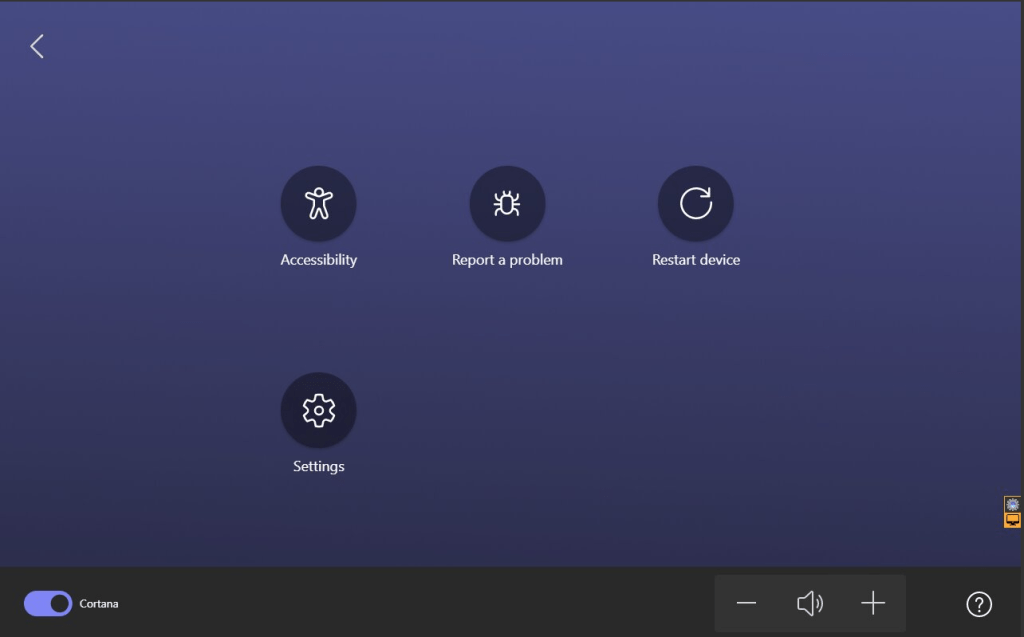
Tapping More on the controller flips the display and gives you additional options such as Accessibility, report a problem and settings. Speaker volume, and a toggle to enable or disable Cortana wake word detection and settings.
The Meet button still starts a meet now meeting. During a meeting the touch controller looks almost exactly the same as it did before. The FoR display shows a box with the meeting details so those in the room can join in.

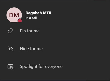
Tapping on any user in the roster brings up a menu.
If you tap on your own user you can pin for you, spotlight for all or hide your self-view.
Tapping on another participant brings up a lot more options including remove, mute and make an attendee.
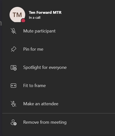
Fit to Frame is a toggle for what you see from rooms and users.
- Fit to frame changes a user from cropped on their face to the full camera shot.
- Fill frame crops to their face from the full camera shot.
- MTR detects video coming from a room and automatically sets it to fit to frame.
In my testing fit to and fill frame only works in gallery only view with or without content being shared. When the gallery is on the right side of the shared content that toggle does nothing and everyone is in fit to frame mode.
There are some changes you might not notice.
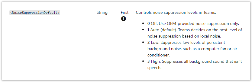
The first is the mic icon. It previously had a dropdown list indicator just like the camera icon. The list under the mic revealed the noise cancellation options. This was always an odd place to put it in my opinion. But Microsoft moved it to the three dots menu. If you open audio settings you get a single toggle to enable or disable the noise suppression.

You still have to set how aggressive you want the noise cancellation in the XML. These are the choices.
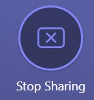
The Share tray is unchanged and still brings up up to three choices if you have a touch screen and content camera connect. Notice if you don’t have anything connected to HDMI it shows an instruction for the user to plug in a device.
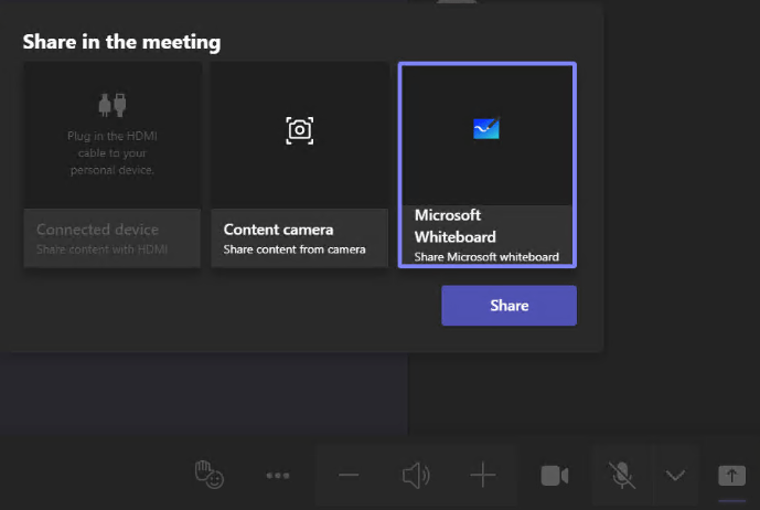
When you have something plugged in to HDMI it changes to HDMI connected to indicate something is plugged in. Just tap to start sharing
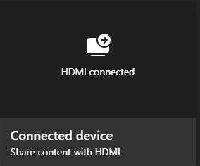
It doesn’t matter what you start sharing. You only need to tap the X to stop sharing.

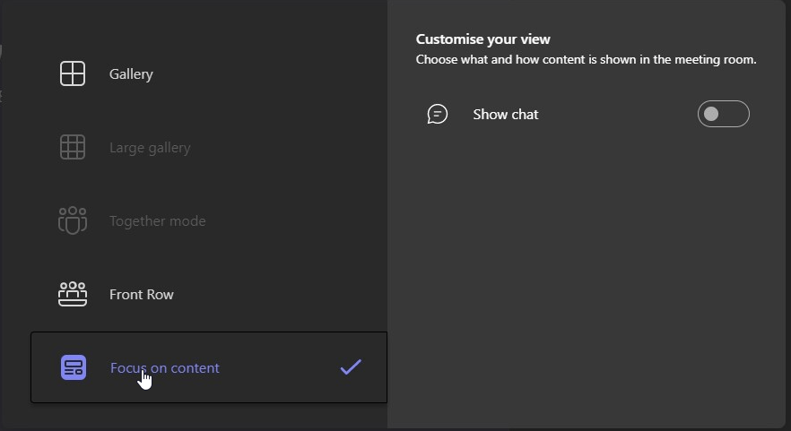
But there is more to see. Layouts has had a huge overhaul to make it a lot clearer and give you additional configuration options.
- You can choose between Gallery, Large gallery (if you have more than 9 people showing video) and Together Mode (if you have more than 4 or 5 with video on).
- If content is being shared you can choose between content + people (default) and people only
- In each layout type you can choose to add the chat rail on the right.
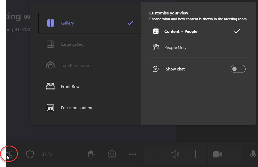
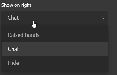
You can also choose Front Row and you get additional configuration options. You can choose what you show on the right and left with any screen size.
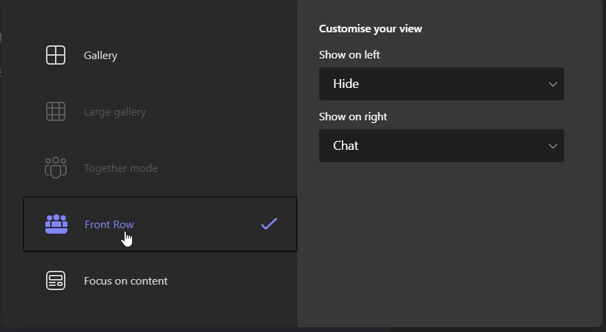
Choose from Hide, chat and raised hands
You can also choose to focus only on the content which gets rid of the gallery and your self-view. But you can also add chat if you want to see it
How do you enable it?
You would think that just having 4.16 installed would change the UI. But you would be wrong. For now Microsoft is making the UI a choice which can be configured by an admin using the XML.
To enable it you need an XML with TeamsRoomsNewExperience set to true.
Create an XML file in notepad and save it as SkypeSettings.xml in this folder C:\Users\Skype\AppData\Local\Packages\Microsoft.SkypeRoomSystem_8wekyb3d8bbwe\LocalState on the MTR compute. Then reboot to make the change live.
<SkypeSettings>
<TeamsRoomsNewExperience>true</TeamsRoomsNewExperience>
</SkypeSettings>
To disable the new UI and go back to the old way just set it to false.
If you want to prepare for the new UI you can set the parameter now and as soon as 4.16 gets installed you should see the new UI after reboot.
Before you go
Backgrounds
Microsoft now has the notion of a background which spans both FoR displays AND the console.

This only works when you use one of the canned backgrounds. Choose from the old rubbish backgrounds or these new backgrounds from Android.

We brought this up in TAP and Microsoft is thinking about enabling admins to change the console to a custom background as well. But they want to make sure what you choose doesn’t detract from the buttons and iconography.
But for now if you change the FoR displays to a custom image, the console adopts that blue colour.
Also, keep in mind that if you had a custom background previously. This might need to be changed depending on what you had on it. Remember there is now a calendar box on the right side screen. I had to reverse my lightsaber so the hilt was on the left. It was previously on the right and the first time I tried the new UI the calendar box obscured the hilt.
Microsoft is working on new guidance for the background image based on the new layout as well as template files to use which shows you what areas to avoid.
Premium features
Microsoft is adding some additional features which requires the meeting organiser to have a Teams Premium license. Including Watermark, End-to-end Encryption for meetings, and Sensitivity labels.
Calendar Changes
- The new calendar is now a shared component between Teams Rooms on Windows and Teams desktop. This means that we are aligning the support for Exchange server versions between both clients. Please ensure your Exchange calendar works well with Microsoft Teams to prevent any calendar issues experienced on Teams desktop from carrying over to Teams Rooms on Windows. Learn more.
- Note that in this app update, customers who are using the Exchange on-prem service may experience limited calendar functionalities in the new home experience, such as not being able to join cross-tenant meetings, forwarded meetings, third-party meetings, and Teams Live Events. To prevent any disruption to your organization, we recommend holding off opting into the new home experience unless you are already using Exchange online service. Calendar feature parity can be expected when the new home experience becomes the default interface.
Wrap up
I personally like the new UI. I like that we have more buttons on the main screen not hidden by more. It’s also great to see more on-screen instructional material. Both will help with user adoption and education. I also like that Microsoft is making the user experience more similar on both Android and Windows. With any luck Microsoft will make them identical. Features aside, users shouldn’t care whether a room has a Nuc or not. They just want to attend and run a meeting.
Thanks for reading. Would love to know what you think
Discover more from
Subscribe to get the latest posts sent to your email.

Thanks for the overview Randy!
Hope you are well!
/scurries away to plan lots of updates to training packs…
LikeLike
I don’t know how to install this 4.16, as the instructions are unclear, can you explain it?
LikeLike
When the update hits the store your room will update automatically. You can do it manually once the update is available to download. https://ucstatus.com/2021/11/01/updates-for-microsoft-teams-rooms/
LikeLike
Thanks Randy,
Switched over ok but not able to set a custom background, it held the existing custom background from before swapping to new UI and I can’t overwrite it; might need to reset the MTR.
Thanks Again
John
LikeLike
I had this in an earlier build. You have to do the XML and file process again to get your suctom background back
LikeLike
Thanks Randy
LikeLike
wall paper rules changed https://learn.microsoft.com/en-us/microsoftteams/rooms/mtr-home-refresh#enable-refreshed-home-screen-design
LikeLike
So they removed the additional 3 lines. Mine has had my lightsabre for years. Old and new UI.
LikeLike
Hi Randy, I do not see the “Cortana” option / feature anywhere after updated to the new UI, is it hidden somewhere?
LikeLike
It has to be enabled in Teams room settings using the XML
LikeLike
To enable Cortana by adding the following line in the XML?
true
LikeLike
Hi Randy,
May I know what is the XML value to enable the Cortana in new Teams Rooms 4.16?
Thank you.
LikeLike
true
LikeLike
Hi Randy, I tried for New User Experience command and once i save the file and reboot. it is not changing. Running with latest update 4.16.
Whats next?
LikeLike
It definitely works. Make sure the XML is correct. And in the right place
LikeLike
yes it worked. I tried once again.
LikeLiked by 1 person
Hi Randy, Great article that helped me a lot! With your instructions I also switched to the new UI and it looks amazing. I’m now looking for a way to remove the “Share” button from the UI because I will not connect a HDMI cable to the device. Users simply connect to the meeting they scheduled and share content. To prevent confused users I need this Share-button to disappear. Is this possible?
LikeLike
I don’t think the share button can be removed. If it could it would be an XML attribute
LikeLike
Hi Randy, I appreciate the info on what’s coming. Do you have any insight into whether PowerPoint Live will be supported on MTRoA anytime soon? Several people, myself included, have reported this to Microsoft as an issue last year, and MS confirmed support was coming, but it doesn’t appear in the roadmap or the known issues page. It’s been a big issue for our employees since we instruct them to use PowerPoint Live for all presentations since it makes video so much better. Not good when it completely fails in the conference rooms.
LikeLike
I don’t have any inside knowledge of this unfortunately. But it would be cool
LikeLike
After updating the UI. which script should we run for customize background in 21:9 screen?
LikeLike
The same one will work
LikeLike
Which one?
I tried: ContosoBackground.png
Didnt work 😦
I tried:
Didnt work 😦
So it will be appreciate, if you can share me the right one.
FYI: Picture is 2080X1080 size and png format.
LikeLike
If you check the message centre there’s an update coming which will let you use a different image on left and right dual display rooms as well as the touch console.
But for single 21:9 displays you just use the standard one.
The image has to be 3840×1080
LikeLike
Just read the message centre post. 21:9 requires 2560×1080 image. I’ll do a new post and edit this one with a link to the newer one. There are 3 attributes now.
LikeLike
I tried the image with 2560*1080, So what will be the 3 attributes, Possible to share here. I am changing the room background now and stuck. Appreciate it.
LikeLike
Use the CustomBackgroundMainFoRDisplay attribute
LikeLike
Hello Randy,
Good day. Do you encounter screen flipped on dual displays after upgraded to MTR 4.17.51.0?
My scenario:
Old UI – Time displays on the left, empty on the right with background only.
New UI – Calendar displays on the left, Time displays on the right.
Based on the URL – https://learn.microsoft.com/en-us/microsoftteams/rooms/custom-backgrounds?tabs=Enhanced
The 16:9 – Dual front-of-room display dimensions should be having the Time displays on the left while Calendar on the right.
It’s not recommended to swap the displays and remain as it is after upgraded.
Thank you.
LikeLike
I’ve seen this. Power down and swap the hdmi. Then power up and see where you are.
Or you can swap displays in settings and see if it persists
LikeLike
Hi Randy, power down and swapped the HDMI cables does not resolved the issue.
Even swap displays in settings does help, but we are not encouraged to do that as when joined the meeting, left screen will become shared screen and right screen will be the video. Whereby we would like to stick with the current settings (left screen = video, right screen – shared screen), to minimize users confusions and feedbacks.
LikeLike
I do a lot of control applications which appear on the “room controls” page of MTRs. Does anyone know if it is possible to download the 5 new backgrounds? I like to do this to keep the “room control” interface and the rest of the MTR unified. Are they stored somewhere on the filespace of the MTR if i book into the admin account?
LikeLike
They will be stored but I don’t know exactly where
LikeLike