
Hello Readers, I hope you’re well.
If you manage a Teams estate and use Direct Routing, you’re in for a treat. At the 2019 Ignite conference in November Microsoft promised to deliver some updates to the Direct Routing Health Dashboard. Now, just 8 weeks later, Microsoft has delivered.
The Direct Routing Health Dashboard started life as a simple tool to tell you whether the SBC was in a healthy state. Now, it includes some very useful reports and views to help admins manage the estate.
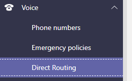
Where is the direct routing health dashboard?
You can find it in the Teams Admin Centre (TAC) under Voice and Direct Routing
What information is there?
The standard view includes 5 key metrics for indicating the health of your SBC(s).
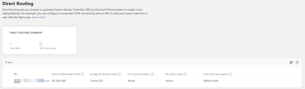

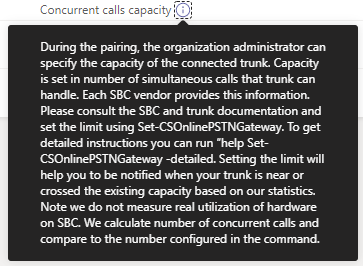
This is the view of a healthy SBC. As you can see, it is active and shows a healthy Network Effectiveness Ratio (NER), TLS and SIP Options status and that it is within limits of channels to concurrent calls.

And now some unhealthy SBCs. These are both attached to my own tenant. To start with, both are inactive because I don’t make many calls on my Teams tenant.
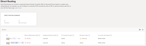
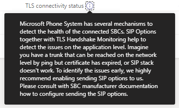
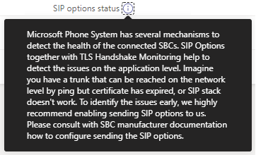
The first SBC obviously needs some attention as its warning me about SIP options. I’ll get to that later.
You can see that the SBC name itself is a URL, which means you can click on it to drill for more information.

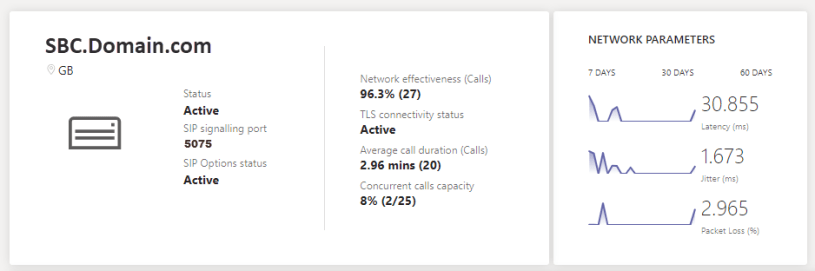
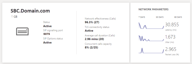
Starting with the summary view
This shows you some of the same basic information from the standard view, as well as its location and some configuration information like the SIP signalling port. Additionally, it shows a few metrics for the network performance for the last 7, 30 or 60 days.

What’s new?
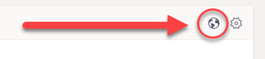
From the main page if you click on the globe  …
…
…here
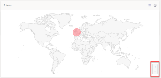
You get a world map of your SBCs with zoom in capability. I only have a couple of SBCs and they are all in a similar location. This would be a lot more fun for global deployments with many SBCs.
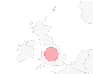
If you zoom in, you can get a more precise location. Although it isn’t that precise. I’m not sure where it gets the location detail. I don’t remember putting in an address when I configured my SBCs. Maybe that’s coming later? Perhaps by DNS or IP information. Useful nonetheless.
Back to the list view, if you drill into an SBC, below the summary tile
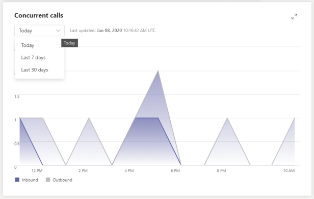
You’ll see a tile with information on concurrent calls with views for today, the last 7 or 30 days.
You also get more details information on network performance including latency, jitter and packet loss. If you hover over the area of concern it shows the precise time, allowing you to correlate with other network tools to investigate further if needed
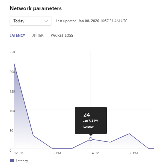
Again, you can change from today to the last 7 or 30 days

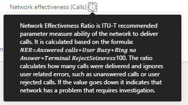
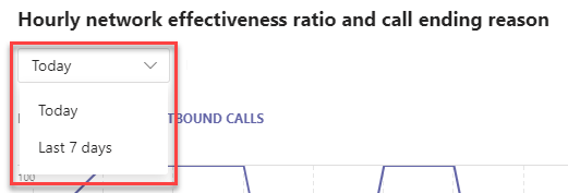
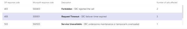
You also get a really useful report on the hourly network effectiveness ratio and call ending reason for both incoming and outgoing calls for today only or the last 7 days.

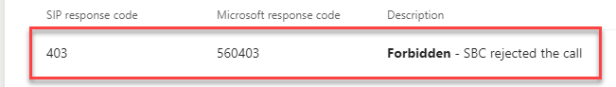
It shows you the SIP response code of any problem calls. You can’t drill into these to get to the calls in question, or get information on call time etc. But you can see the number of calls affected so you can look into it elsewhere. Perhaps in the call quality dashboard.
Wrap up
I think you’ll find that there is some very useful information in these new reports. I can see the health dashboard improving even more. I’l personally love the ability to drill into these reports and look at actual call data which could help with troubleshooting. But we have to start somewhere.
I’d love to know your thoughts on what you think and what other improvements you’d like to see.
Great job Microsoft Teams team! Keep up the good work.
Discover more from
Subscribe to get the latest posts sent to your email.

This is great however is there a way to alert you via an email etc if the status changes to inactive for an SBC?
LikeLike
Not from Teams. You’ll need external monitoring for that
LikeLike